The SaaS checkout process is where potential customers become paying subscribers, making it critical to get right. A poorly designed checkout can lead to abandoned carts and lost revenue. Here’s a quick breakdown of what matters most:
- Clarity in Pricing: Display all costs upfront (base price, taxes, fees, billing cycles). Hidden fees are a major turn-off.
- Simplified Forms: Only ask for necessary details like email and payment info. Too many fields increase drop-offs.
- Multiple Payment Options: Include credit cards, digital wallets (Apple Pay, Google Pay, PayPal), and even Buy Now, Pay Later options.
- Real-Time Error Validation: Catch mistakes as users type to reduce frustration.
- Guest Checkout: Don’t force account creation - let users buy first and sign up later if needed.
- Localized Experiences: Tailor currency, payment methods, and language for global audiences.
UX Improvements to Reduce Customer Friction in Online Checkout
Core Elements of an Effective SaaS Checkout
An effortless checkout process builds trust - an essential ingredient for creating lasting customer relationships. When done right, a SaaS checkout not only converts visitors into paying customers but also lays the groundwork for ongoing loyalty. Here's a breakdown of the key elements that make a SaaS checkout effective.
Clear Pricing Displays
Transparency in pricing is non-negotiable. Show all costs upfront - base price, taxes, fees, and billing cycle details. Hidden fees or unclear billing terms are major reasons customers abandon their carts.
Break down the pricing structure clearly before users enter payment details. Include everything: the base price, taxes, setup fees, and any additional charges. This visibility reassures users and eliminates unpleasant surprises.
Make billing cycles and renewal dates unmistakably clear. Whether it's monthly or annual billing, users should know exactly when they'll be charged and when their subscription will renew.
To further ease decision-making, consider adding value reminders next to pricing details. For instance, highlight the main features or benefits included in the plan. This not only justifies the cost but also reduces hesitation during checkout.
Simple Input Requirements
Keep it simple. Only ask for what’s absolutely necessary - email, payment details, and billing address. The more fields you add, the higher the likelihood of users giving up midway. Skip non-essential questions like company size or phone numbers; these can be gathered later during onboarding or through your product interface.
Smart form design can make a big difference. Features like auto-formatting for credit card numbers, real-time error validation, and logical field ordering help minimize user effort. For example, asking for a billing address immediately after payment details feels intuitive and reduces mental strain.
Another way to cut down friction is by allowing users to complete their purchase first and set up their account afterward. This approach lets users act on their initial motivation to buy, with account setup becoming a less stressful, secondary step.
Multiple Payment Options
After simplifying pricing and inputs, offering a variety of payment methods is key to reducing friction further. Payment flexibility is critical since users often have strong preferences for how they pay. If their preferred method isn’t available, they’re more likely to abandon the checkout process.
Digital wallets are becoming increasingly popular. Options like Apple Pay, Google Pay, PayPal, and Link allow customers to use stored credentials, eliminating the need to manually enter payment details. In fact, Salesforce reported a 62% increase in digital wallet transactions in Q3 2023 compared to the previous year. Businesses that adopt these methods quickly can gain both sales and customer loyalty.
Traditional payment methods, like credit and debit cards, remain essential. However, streamline these processes where possible. For example, direct debit payments can be simplified with real-time account connections to financial institutions, avoiding the need for customers to manually input routing numbers, BICs, or SWIFT codes.
Emerging payment options, such as Buy Now, Pay Later (BNPL), are also gaining traction in the SaaS world. Over half of commerce leaders (61%) now offer installment payment options, with 32% planning to introduce them within the next two years. These options can make higher-tier plans more accessible to budget-conscious customers.
To maximize conversions, ensure your platform supports a variety of payment methods, including newer options. Running A/B tests on different payment methods can also help identify which ones resonate most with your audience, ultimately improving your checkout performance.
Optimizing the Checkout Flow for SaaS
Once you've nailed down the basics of your checkout process, it's time to fine-tune the flow itself. A smooth and efficient checkout experience takes users seamlessly from decision to purchase, removing any roadblocks that might lead to cart abandonment. A well-optimized flow not only completes the transaction but also strengthens users' confidence in your SaaS product.
Streamline User Navigation
The fewer steps between "I want this" and "purchase complete", the better. Single-page checkouts are a great way to simplify the process. By displaying everything - pricing, payment fields, and confirmation - on one page, users can see the full picture, which helps build confidence and reduces the chances of them abandoning the process.
If a single-page checkout isn’t feasible, progress indicators are a must. Clear visual cues like "Step 2 of 3" or a progress bar show users exactly where they are in the process. This transparency makes the journey feel manageable and keeps users engaged.
Another important tip: reduce the number of steps wherever possible. Each additional step increases the risk of users second-guessing their decision or getting distracted before completing their purchase.
Also, make it easy for users to correct mistakes or change their selections without starting over. For example, if someone realizes they picked the wrong plan while entering payment details, they should be able to adjust it without losing their progress. This kind of flexibility shows respect for their time and keeps frustration at bay.
Once navigation is smooth, the next step is addressing errors in real-time to keep the momentum going.
Real-Time Error Validation
Nothing breaks the flow of a checkout process like discovering errors after hitting "Submit." Inline error validation solves this by catching mistakes as they happen, allowing users to fix issues immediately. This eliminates the annoying back-and-forth of resubmitting forms and hunting for what went wrong.
For instance, if a user enters an invalid email address, the system should flag it instantly with a clear and specific message, like "Please enter a valid email address." Similarly, for credit card details, validate the format as users type, and even identify the card type (Visa, Mastercard, etc.) automatically. These real-time prompts make the system feel like it’s working with the user, not against them.
Small touches like default settings and auto-formatting can also prevent errors before they happen. Automatically formatting phone numbers, adding spaces to credit card numbers for readability, or capitalizing names properly all contribute to a smoother experience. These details might seem minor, but they leave a lasting impression of polish and care.
Guest Checkout Options
Once you've streamlined navigation and error handling, it’s time to tackle one of the biggest friction points: mandatory account creation. Requiring users to create an account before purchasing is a common reason for cart abandonment, especially for SaaS customers who might still be comparing options.
Make guest checkout the default option. Surprisingly, 50% of websites fail to prioritize this. Your checkout page should make it crystal clear that users can complete their purchase without registering. The messaging should be straightforward and reassuring, so users know they won’t be forced into creating an account.
Labeling matters here. For example, in November 2024, Baymard Institute found that unclear labels hurt conversion rates. Gucci’s checkout used vague wording like "Continue with your email address", which left users unsure if registration was required. Best Western made their guest option difficult to find by hiding it behind a subtle radio button with confusing text. On the other hand, Etsy nailed it by putting their guest checkout option front and center, making it easy to spot.
Timing also plays a critical role. Ask users to create an account only after they’ve completed their purchase. By that point, they’ve already committed to your service and are more likely to see the value in managing their subscription through an account.
For users who want convenience without registering, consider offering social sign-on options like Google or Microsoft. These options strike a balance between ease of use and collecting necessary user information.
A smooth guest checkout experience builds trust and leaves a positive impression. When users feel in control and unpressured, they’re more likely to return - and might even create an account willingly down the line. Instead of being a hurdle, the checkout process becomes an opportunity to make a great first impression.
sbb-itb-a989baf
Advanced Features to Improve SaaS Checkout UX
Take your SaaS checkout experience to the next level with advanced features that not only boost conversion rates but also enhance customer satisfaction. By building on the basics of clear navigation and user-friendly design, these features can turn a routine transaction into a smooth and enjoyable process.
Localized Payment Experiences
For SaaS businesses with a global reach, offering a one-size-fits-all checkout won’t cut it. Tailoring the payment experience to meet regional preferences - like currency, language, and formatting - can make all the difference.
Start by displaying prices in local currencies throughout the entire customer journey, from the pricing page to checkout. For instance, show $29.99 for US users, €27.50 for European customers, or ¥3,200 for those in Japan. This eliminates the need for mental currency conversion, reducing friction and confusion.
Regional payment methods are equally important. While credit cards might dominate in the US, customers in Europe may prefer SEPA direct debit or iDEAL, and in Asia, digital wallets or bank transfers may be more common. Offering payment options that align with local preferences builds trust and simplifies the process.
Language and formatting also play a crucial role. For example, US users expect dates in MM/DD/YYYY format, while many other regions use DD/MM/YYYY. Similarly, European customers often expect VAT-inclusive pricing, whereas US customers are accustomed to seeing tax added at checkout. Even small details, like aligning subscription billing notifications with local time zones, contribute to a seamless experience.
By localizing these elements, you not only improve the user experience but also open the door to increased revenue opportunities.
Upselling and Cross-Selling Opportunities
The checkout process isn’t just about completing a transaction - it’s also an opportunity to suggest upgrades or add-ons that enhance the customer’s purchase. When done right, upselling and cross-selling can feel like helpful recommendations rather than intrusive sales tactics.
Timing is everything. The ideal moment to present an upsell is after the customer has selected their primary purchase but before they finalize payment. For instance, if someone chooses a basic subscription plan, you could suggest upgrading to a higher tier by highlighting added benefits, like support for more team members or advanced features.
Discounts can also be an effective incentive. Offering 20% off for annual billing, for example, can encourage customers to commit to a longer-term plan. The key is to present these options clearly and unobtrusively, ensuring they feel optional rather than forced.
Upselling isn’t just about plans - it can include add-ons like premium support, additional integrations, or enhanced security features. These extras should be framed as value-added choices that genuinely benefit the customer.
One-Tap Payments with Digital Wallets
Digital wallets have revolutionized the checkout process, making payments faster and easier - especially on mobile devices. By eliminating the need for manual card entry, one-tap payment options significantly reduce friction and improve the overall experience.
Instead of typing out a 16-digit card number, customers can complete purchases with a single tap using services like Apple Pay, Google Pay, PayPal, or Link. As Ordway explains:
"Allow customers to pay with stored credentials in digital wallets such as Apple Pay, Google Pay, PayPal, or Link rather than making them type in 16-digit card numbers and expiration dates."
Featuring digital wallet options prominently in your checkout can also boost customer confidence. Familiar logos like Apple Pay and PayPal are instantly recognizable, reassuring users of the security and simplicity of the process. For newer SaaS companies looking to build trust, this can be particularly impactful.
The benefits are clear: one-tap payments streamline mobile checkouts, improve conversion rates, and enhance security. Research suggests that improving checkout design can lift conversion rates by as much as 35%. Considering that the average checkout completion rate for Shopify stores is just 45%, even small improvements - like integrating digital wallets - can lead to significant revenue gains.
To maximize the impact, test different placements, button sizes, and combinations of wallet options. A/B testing can help you find the setup that works best for your audience, ensuring a checkout experience that’s as seamless as it is effective.
Choosing the Right Payment Provider for Your SaaS
Once you've fine-tuned your checkout experience, the next step is selecting a payment provider that complements it. The provider you choose doesn't just process transactions - it can directly influence your conversion rates and operational efficiency. A well-chosen provider works hand-in-hand with your optimized checkout design to drive better results.
What to Look for in a Payment Provider
A seamless checkout can boost conversions, but the right payment infrastructure ensures those gains are realized. When evaluating providers, focus on these key areas:
- Recurring billing capabilities: Your provider should effortlessly manage subscriptions, handle plan changes (like proration), address failed payments through dunning management, and support all stages of the customer lifecycle.
- Developer-friendly APIs: Look for APIs that come with detailed documentation, SDKs in multiple programming languages, and webhook support. These features enable you to integrate advanced UX elements like real-time validation and custom localization.
- Global compatibility: As your SaaS expands, you'll need support for multiple currencies and regional payment methods to cater to international customers.
- Transparent pricing: A clear fee structure is essential to avoid unexpected costs. Pay attention to both percentage-based fees and fixed transaction costs - especially if you offer low-value subscriptions, where fixed fees can eat into margins.
- Security and compliance: Your provider must offer robust protections, including PCI DSS compliance, fraud prevention tools, and adherence to regional regulations like GDPR in Europe or PSD2 for authentication.
- Settlement times: Quick access to funds can be crucial for growing businesses. Some providers offer daily payouts, while others may delay disbursements. Faster settlement times can improve cash flow, helping you reinvest in growth.
Simplifying the Selection Process with 'Choose a Payment Provider for Your SaaS'
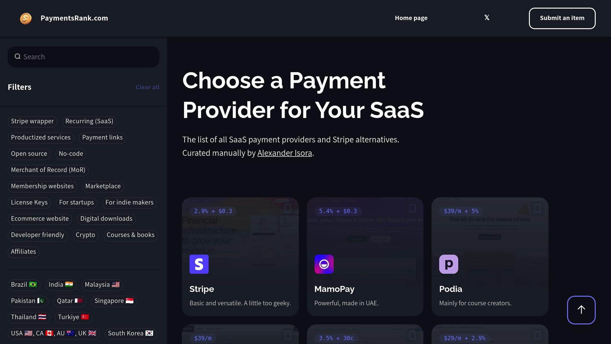
With so many providers offering different features and pricing models, finding the right one can feel overwhelming. That’s where Choose a Payment Provider for Your SaaS comes in - a specialized comparison platform designed specifically for SaaS businesses.
This platform streamlines your decision-making with tools like:
- Feature-based filtering: Easily narrow down providers based on your needs, whether it’s recurring billing, no-code integrations, cryptocurrency support, or license key management.
- Side-by-side comparisons: Instead of sifting through marketing materials, you’ll get clear, transparent comparisons of pricing, features, and limitations, saving you hours of research.
- Comprehensive FAQs: Practical resources help you tackle common challenges, like managing failed payments or navigating international tax compliance.
For businesses with unique needs - such as marketplaces, membership sites, or digital downloads - the platform categorizes providers based on their specialties. This ensures you find a partner that truly understands your business model instead of settling for a one-size-fits-all solution.
The platform also offers global coverage, with options tailored to specific markets. Whether your focus is the U.S., Europe, or emerging regions in Asia and Latin America, you’ll find providers equipped to meet your geographic requirements. It’s an ideal tool for SaaS companies aiming to optimize their checkout experience while scaling globally.
Conclusion
A smooth and efficient SaaS checkout process eliminates obstacles between your customers and their purchase. A thoughtfully designed user experience can be the deciding factor between a 70% cart abandonment rate and a seamless conversion.
Key Takeaways
The best SaaS checkout experiences focus on three main pillars: simplicity, transparency, and flexibility. Simplicity ensures fewer form fields and an intuitive flow that guides users effortlessly. Transparency means showing all costs upfront - 48% of users abandon their carts when they encounter unexpected charges.
Flexibility extends beyond offering multiple payment methods. It includes features like guest checkout, mobile-friendly designs, and options like Buy Now, Pay Later. Businesses that introduced guest checkout and diverse payment options saw a 27% drop in cart abandonment within three months.
"A well-designed checkout UI moves users forward without hesitation. A clunky UI can introduce just enough doubt to make them leave." - Stripe
Real-time error validation and progress indicators play a key role in minimizing frustration. When users can fix mistakes instantly instead of discovering them after submission, they’re far more likely to complete their purchase. Optimized checkouts have been shown to increase revenue by 11.9%.
Next Steps for SaaS Businesses
To take your checkout process to the next level, start by auditing it with fresh eyes. Go through it as if you were a first-time customer, noting any areas of friction or confusion. Pay special attention to mobile users, who make up a growing share of online transactions. Review your form fields, test error messages, and ensure total costs are clearly displayed early in the process.
Experiment with A/B testing to identify which checkout designs resonate best with your audience. Even small changes, like repositioning the guest checkout option or improving the display of payment methods, can yield meaningful results.
"Offering early visibility into the total cost of a transaction will not only lower your abandoned cart rate, but it will also prove an investment in the trust - and lifetime value - of your customers." - Stripe
Lastly, reliable payment processing is non-negotiable. Refer to Choose a Payment Provider for Your SaaS to find a solution that supports advanced features like real-time validation APIs, international payment options, and flexible billing systems. These tools are critical for creating a checkout process that converts.
FAQs
Why do users abandon their carts during the SaaS checkout process, and how can this be prevented?
Cart abandonment in the SaaS checkout process often happens due to a complicated flow, surprise fees, or limited payment options. To combat this, focus on making the experience straightforward and user-friendly.
Start by cutting out unnecessary steps and offering a guest checkout option - nobody likes jumping through hoops to complete a purchase. Be clear about all costs, including taxes and fees, to eliminate any last-minute surprises that might drive users away. Make sure to provide a variety of payment options, such as popular digital wallets, to cater to different preferences. And don’t forget mobile optimization - many users finalize purchases on their phones, so your checkout should work smoothly across devices.
By keeping things simple, transparent, and adaptable, you can reduce cart abandonment and boost your conversion rates.
How does offering localized payment options boost conversion rates for SaaS businesses?
Providing localized payment options can significantly boost conversion rates for SaaS businesses. Why? Because it creates a checkout experience that feels natural and familiar to users, no matter where they’re located. When customers see their local currency, familiar date formats, or region-specific details, they’re more likely to feel at ease and complete their purchase.
Beyond that, tailoring to regional preferences - like offering popular payment methods or aligning with local language norms - can foster trust and eliminate unnecessary hurdles. These thoughtful tweaks not only make the checkout process smoother but also leave customers more satisfied, ultimately driving better sales results.
How does real-time error validation improve the checkout experience for SaaS users?
Real-time error validation makes the checkout process smoother by providing users with immediate feedback when something goes wrong - like typing in invalid payment details or skipping required fields. Instead of waiting until the end to catch mistakes, users can fix issues on the spot.
This approach reduces confusion and eliminates the need for repeated attempts, saving users from unnecessary frustration. By simplifying the process, it boosts user satisfaction and lowers the likelihood of cart abandonment - a win for both customers and businesses.